Monday, 23 April 2012

Video Evaluation - How did you attract/address your audience?

Me addressing the question: "How did you attract/address your audience?"


Notes:

Well we started by opening with a logo that stands out. The large red fist is a symbol of independence, which links in with the fact that we are an independent film company. We took a survey and found that eight out of ten teenagers agreed that our logo got their attention, which was long enough to get them to watch the first two minutes of our film.

The opening establishing shot of the tunnel would have appealed to our male target audience of 16-25 because of the artistic graffiti on the walls that establishes the urban setting. A quick survey showed us that the majority of our target audience are interested in street art/graffiti.

We knew that viewers would be surprised by our juxtaposition of the antagonist wearing a suit. The clothing contrasts with the urban setting and raises the question as to why he was there, and what he did to wind up there.

We also knew that by establishing the main character as an antagonist, rather than a protagonist, people would find it interesting. This is because in almost every film or tv show the good guys always win. We changed that in Remembrance.

Friday, 20 April 2012

Tuesday, 17 April 2012

Video Evaluation - Looking back at your preliminary task, what do you feel you have learnt in the progression from it to the full product?

Here I am addressing the question "Looking back at your preliminary task, what do you feel you have learnt in the progression from it to the full product?"

Monday, 16 April 2012

Video Evaluation - What have you learnt about technologies from the process of constructing this product?

In this video, I answer the question "What have you learnt about technologies from the process of constructing this product?"


Notes:

We used editing software such as Premiere, Photoshop, and audition, to optimise the three key elements that makes our film successful. Visuals, Audio and screenplay.

We learnt a lot during the filming of our production. One of the most important decisions we made was to use a DSLR over the school’s SD camcorders. After doing a little research, we found that by using an SLR, we had the option to use a variety of lenses with variable apertures, shutter speeds, and manual focus. This was huge.

Rather than recording onto tape, we recorded to a 16GB SD in 720P at 24 frames per second which is US film standard.

The camcorders recorded at either 30 or 60 frames per second which is preferable for sports over actual film. This is changeable in POST using premiere, but it proved more efficient to get as much correct in camera as possible, to avoid loosing quality from over processing the final clips.

We wrote more of the story than seen in the two minute slot. This was so that we had more to talk about un terms of where our film would go if we were to go on and produce the whole thing. We knew this was important because it helped us to perfect the story for the two minute slot and It allowed us to make the clip flow more like an actual beginning to a film, rather than making the mistake of making it a trailer which isn’t the task set.

We used a tripod to help us achieve steady shots throughout our production. This proved extremely helpful an made our film more successful than if we were trying to record with handheld shots.


Screenshot of saved optimal export settings for my camera at 1280x720 @ 24, or 29.97 FPS:


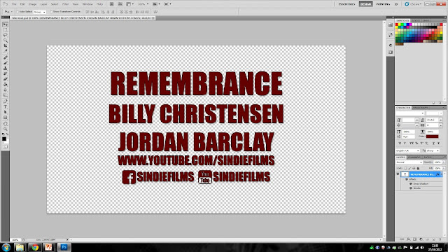
Screenshot of a quick title reel I made as a template for the new title design and font:


Photoshop's advanced layer effects settings used to enhance text:


Saturday, 14 April 2012

Evaluation Notes


Problems Encountered During Production

And, I might add; a problem with this very video. When I exported it, I did not double check the export markers (the sliders that set exactly what part of the timeline is being exported) were correct and I seem to have unintentionally cut off the first fifteen seconds of footage. No 'major' information is missing though, so it's not worth re-exporting it for an hour for the sake of a title and me saying hello. This has taught me to double check and take extra care before exporting video files as they take a long time to render and tf it's wrong then time has been wasted.


Remembrance - Directors Commentary

We decided to do a little commentary over the top of our video to communicate our key ideas, comments and thoughts on each individual shot.


Friday, 13 April 2012

Remembrance - Final Product

This is our final video!


The clip is the full embedded video that can be viewed in 720p widescreen HD on YouTube directly.

We feel that the video is extremely successful and better than what either of us predicted!

Friday, 6 April 2012

Advanced Editing in Premiere Pro

Demonstrating my understanding of Premiere Pro. Here I am using the rolling edit tool to quickly sync the cut between two clips, making the cut perfect. I have full understanding of all of the timeline editing tools available. In the second window, I am previewing a segment after syncing each video chunk before placing it onto the main timeline that we will be exporting.


Wednesday, 4 April 2012

Final Transparent Logo

here are two of my transparent logos. This is a demonstration of our finial design that will be used in our videos. 


Monday, 12 March 2012

Practical Propmaking: Blood

We had a little fun trying to create realistic looking blood. We tried all sorts of mixtures, and finally ended up with a mixture of water, red food die, raspberry and strawberry jam.


Tuesday, 6 March 2012

Character Profile - Billy

Billy is a lost and troubled soul. His past is a blur, but only one thing remains true; His desire for power. He will stop at nothing to gain revenge on the people that double crossed him, by any means necessary.
After murdering his own brother for ratting him out to another gang, Billy is on the run.

One man's journey to seek out those who crossed him, where all he has left is his wits.


Due to our main character - Conor not turning up to our first filming session, we decided to have billy act and allow me to direct and record. We felt this went extremely wella s the small group allowed minimum arguements and more focused work.

Monday, 5 March 2012

Shot List


This is our Shot-list. It details the technical and visual elements of every single shot we intend to shoot. There is of course the possibility that we deviate slightly from this plan with a few extra shots in places.

In order to optimize our filming time, I have decided to film each clip three times, slightly differently, perhaps with alternative compositions. this allows for maximum flexibility later on in the editing stage and also reduces the chances of us needing to come out and shoot again. Additionally, by shooting extra clips that are not included in the list, we will be giving ourselves even more flexibility by having clips to 'fall back' on, should we decide not to use one of our planned shots for whatever reason.

With this plan, we intend to aim to complete most, if not all of our filming in one day. We have given ourselves time int he time plan to go back and film more, should the need arise. This also applies to editing time in order to meet the deadline.

Credit to Jordan Barclay

Wednesday, 29 February 2012

Age Certifications

We did a little research and found that our film would be just suitable for a 15, as it is very close to the rated 18 certificate. There would be a few violent scenes in the film and drug use.

Target Audience - Video Interview & Profiles


Credit to Billy Christensen.

Institutions Related to Psychological Horror

Institutions related to our genre
View more PowerPoint from BillyZor95

Credit to Billy Christensen.

Logo & Colour Connotations Developments


Logo development

Credit to Jordan Barclay. 

Production/Institution Logo Shortlist


Credit to Billy Christensen.

Costumes for Main Character


Credit to Billy Christensen.

Props


Credit to Billy Christensen.

Visual, Image-Based Storyboard

Visual storyboard
View more PowerPoint from BillyZor95

Photography by Jordan Barclay.
Presentation composed by Billy Christensen.

Location Shoot

Location shoot
View more PowerPoint from BillyZor95

Photography by Jordan Barclay.

Presentation composed by Billy Christensen.

Film Classifications

Film classification
View more PowerPoint from BillyZor95

Credit to Billy Christensen.

Character Profile


Images by Jordan Barclay.
Written by Billy Christensen.

Production Name

Production name brainstorm
View more PowerPoint from BillyZor95

My partner and I composed this brainstorm of ideas. Since we narrowed it down to Remembrance, I am going to use Photoshop to design a title and institution logo to be layered over the first few seconds of the video.

Ideas submissions by Jordan Barclay & Billy Christensen.
Presentation by Billy Christensen.

Logo & Title Font Designs


Here are a few interpretations of the logos and fonts that we like. All content was sourced from royalty free, public sources to avoid any possible copyright infringement. The use of the Blogger logos will be used to write our blog page URL's underneath the production title overlay.


Credit to Jordan Barclay.

Thursday, 9 February 2012

Preliminary Exercise

This is our preliminary basic filming exercise. It's only purpose is to demonstrate that we know how to use a camera and correctly set up shots. It was made up on the spot, and not rehearsed in any way.


Filmed By Jordan Barclay
Edited by Billy Christensen.

Friday, 3 February 2012

Main Characters & Costumes Mood Board


These mood boards help us to identify what shots are commonly used in horror films. Depth of field is used heavily to obscure the backgrounds of shots to make the audience curious and suspicious of hidden elements. The use of suits in horror films provides a strong level of juxtaposition and we will experiment with the use of suits in our production.

The use of long shots also work well because it leaves out just enough detail to leave the audience curious, whereas the close ups are designed to shock the audience.

Credit to Jordan Barclay.

Wednesday, 1 February 2012

Genre Conventions


Further genre conventions
View more PowerPoint from BillyZor95

Credit to Billy Christensen.

Genre Research - Psychological Horror


Genre research

What is a Psychological Horror?

Psychological Horror films differ from your typical slasher horror like saw. Psychological horrors rely on taking a character that the audience can (but not all the time) relate to and focus on creating fear through sound effects, mise en scene, guilt, sound, and fate. Slashers focus almost entirely on making the audience jump with sudden loud sounds or feel scared by the gore and dismemberment on-screen.

Psychological horror is a lot more subtle when compared to traditional horror films and usually does not rely on physically harming people as much as typical horror does. The genre tends to play on sexual themes and relationships to build a more emotional link with the audience, and, in turn, makes it more dramatic to watch. You can usually expect psychological horrors to play on a character’s mental and emotional weaknesses and/or disease and suffering to exploit them.

Psychological horrors are technically achievable and executed by using strong, crisp sounds to add atmosphere to the scene. Typical settings include dark rooms, basements, forests etc. Boom microphones next to someone’s feet as they walk could achieve the ‘footstep sound’ that feature in a lot of horrors. To get the eerie howling/fading in sounds you could record a moan or a scream and over-produce it and change pitch, tempo, or key. Camera effects, if used and chosen appropriately can also increase the effect of the scene, for example film grain or black and white / high contrast. High angle shots could be used to make characters seem weak and vulnerable in the dark.


We will use this research to help us to structure a successful horror opening that matches the genre well. A lot can be learned from simply watching other psychological horror films and thinking carefully about elements used in each film.


Key elements include:


  • Sound
  • Lighting
  • Supernatural Presence
  • Camera-work
  • Transitions
  • Visual effects
  • Narrative

If we can get all of these key areas covered we will be able to produce a successful end product that fits well amongst other psychological horror films.


Credit to Jordan Barclay.

Conventions of Genres

Conventions
View more presentations from Jordan Barclay.

Credit to Billy Christensen.

Monday, 30 January 2012

Audience Survey

A survey we conducted to see what our target audience is looking for in each genre. This has helped us to decide on suitable themes for our film.
Survey
View more PowerPoint from BillyZor95

Credit to Billy Christensen.

Thursday, 26 January 2012

Analysis - Tears


Textual Analysis – Tears – Horror
Representation
·         Very little to talk about in the first two and a half minutes of the film – occupied by credits.

·         There is no male presence in the first four minutes and the supposed antagonist (ghost/zombie) is female, indicating a strong, heavily female dominated film.

Represents the little girl as helpless and vulnerable. She doesn’t run away from the ghost, but bravely and intriguingly stares at it, slowly backing off, which is a positive representation of brave children.
Editing/Camerawork
·         The first scene is a two minute credit sequence. Shot type does not seem to apply but there are some clouds very slightly visible in the background, possibly a panning shot.

·         The titles and credits fade in and out eerily as if they themselves were ghosts. This subtly helps to establish the horror genre. This flows well with the slow instrumental orchestral music and immerses the audience.

·         The editing is subtle and hard to spot. The film was produced on a budget of 10k so there isn’t much CGI apart from the seemingly animated tears behind the titles and beams of light. These link with the film title and help to establish and convey the horror genre.

·         The jump cut when the ghost goes to grab the girl’s neck is sudden and scares the audience with it’s sudden, spontaneous and unexpected appearance. It also jump cuts towards the camera at the end of the clip.
Sound
·         The sound is parallel and non-diegetic although there is no ‘actor’s world’. The orchestral nature of the music gives it an eerie feeling that should make the audience feel tense. This also helps to convey the genre and also builds up to the opening scene.

·         In the first scene of the girl swinging on the swing, synchronous sound of wildlife ad nature is used. The reason is unclear as it bears no strong links to horror, but it does set the scene and makes the little girl seem separated and alone. This sound becomes quieter and an eerie ghostly noise fades in when the ghost appears on the camera. This interrupts the tranquil mood with its presence.

Mise En Scene
·         The scene is set in an empty, secluded light forest area. The costume of the girl is white connoting happiness and freedom whereas the ghost is completely black and shadow in a dirty white shirt. The colour connotations help the audience to tell who is who in this genre of film.

·         The blood on the ghost and dirt on the shoes of the child add dirty details to enhance the gritty presence in the film. It is a rarity to see perfectly clean characters/clothing in a horror.


How is the genre established?


The clip opens with a two and a half minute credit sequence accompanied by synchronous non-diegetic sound that builds and adds atmosphere. During this time it is possible for the audience to make the connection that it is a horror film, due to the presence of the sound and presentation of the ghostly text effects and tears running down the screen. When the sequence ends, it fades to black and then fades back into the first scene of a girl on a swing set, alone in a forest. The camera peeks through some trees, giving the audience the idea of a 1st person perspective, and also cuts to a close up of the swinging rope. This relates to being hanged. This is reinforced by the shot of her feet barely scraping the ground.
The camera cuts to a long shot from the side of the girl swinging as a dead body swings in to view, hanged from the neck. The sound reaches a crescendo and the body falls to the floor and reaches out to the girl, with the sound now extremely eerie and terrifying. The camera cuts to an extreme long shot/establishing shot of the ghost walking towards the camera, then jump-cutting into the camera fading to black. This connotes the horror genre with the use of blood and gore, symbolism of hanging, and dark music.

Credit to Jordan Barclay.

Saturday, 21 January 2012

Analysis - Training Day

The opening sequence was unavailable on YouTube or Vimeo for my analysis, so I was forced to do it on the trailer instead.
Traning day

Credit to Jordan Barclay.

Wednesday, 18 January 2012

Research Time Plan Gantt Chart

Gantt Chart


This chart will aid me in planning the amount of time each section needs spent on it. It will help me and Billy to keep on track and to work at a constant, organised rate.


Credit to Jordan Barclay.

Assessment Criteria & Time Management


This grid outlines the tasks we have set ourselves to best meet the assessment objectives.

Credit to Billy Christensen. & Jordan Barclay.

Monday, 16 January 2012